by David Hakala
Charts make boring worksheets interesting. They also convey lots of information at a single glance. The new ribbon bar in Excel 2007 makes it easier than ever to fill your workbooks and other documents with nifty charts of all kinds.
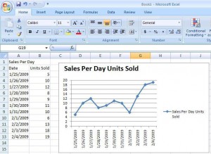
First, create chartable data. This generally consists of a table of two columns, since most charts are two-dimensional. In one column goes the element values to be charted (sales/day in the example below) and in the other goes the data series (dates). Note that the data series values should be in linear progression. Don’t enter Jan. 1, Jan. 10, Jan. 2, for example. The resulting chart would be confusing. Use the Data Sort function to sort data series into a coherent order.
Select the Insert tab on the ribbon bar and click the type of chart you want. More chart types are available by clicking the “Other Charts” icon. Presto! You got chart right next to your data table!
Click on one of the elements within the chart until an outline with “handles” surrounds it. Now drag the graph, labels, etc., anywhere within the chart you wish. Click on the outer edges of the chart to outline it and move it around, or stretch the chart’s shape.
You can edit the text in chart labels without affecting the text in the table.
Right-click on the whole chart or any element and you will get a drop-down menu of other formatting and editing options. Also, when you select the chart the ribbon bar will change to show many more chart formatting options in a “Chart Tools” area that takes up the right-hand half of the ribbon bar.
Just don’t get too fancy. Remember, “The power to create is the power to make ugly.”
David Hakala has perpetrated technology tutorials since 1988 in addition to committing tech journalism, documentation, Web sites, marketing collateral, and profitable prose in general. His complete rap sheet can be seen at http://www.linkedin.com/in/dhakala
